|
3/6/2018 2 Comments 2 years of art.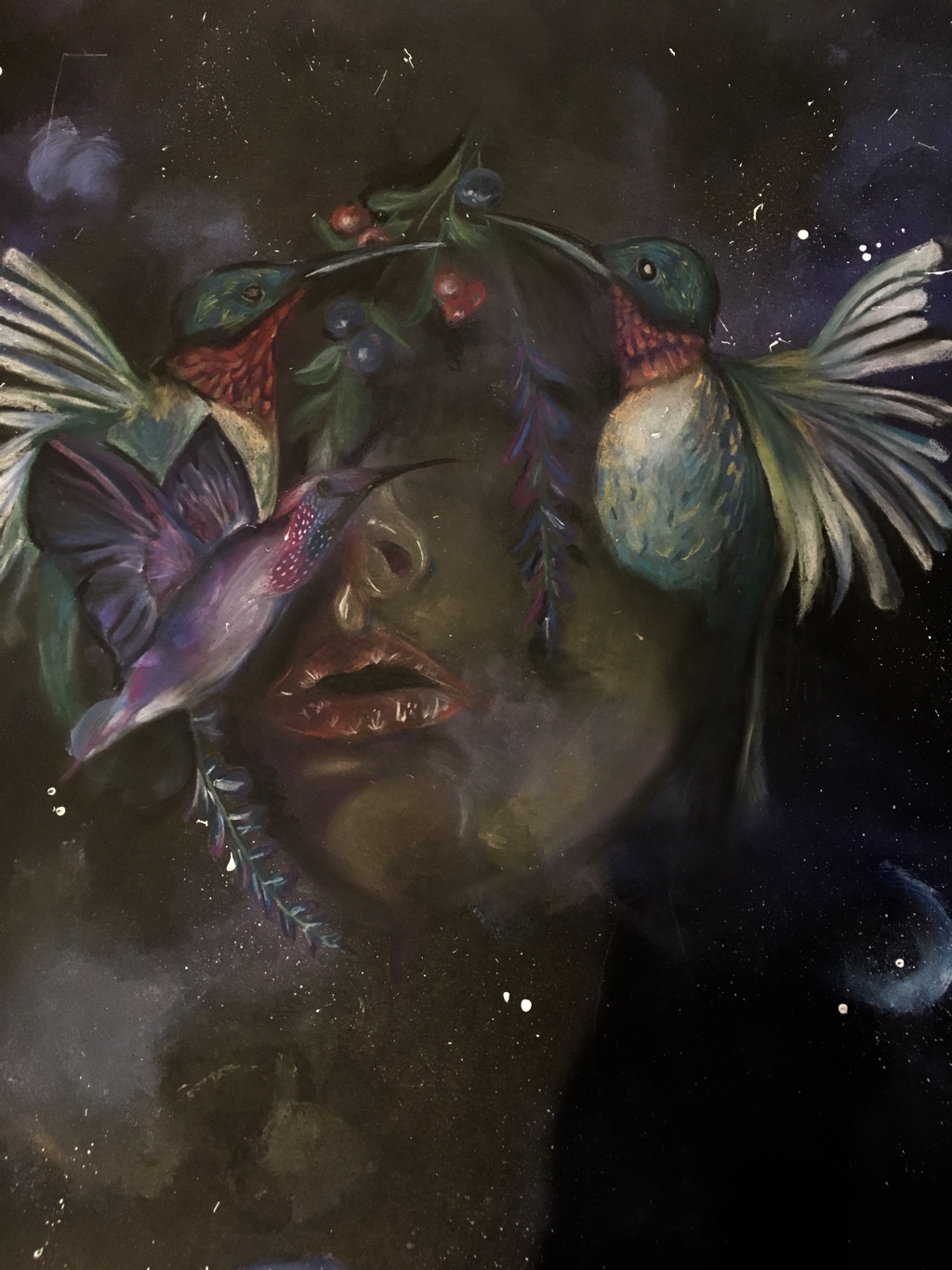 i have come to the end of my Alevel in fine art, but I honestly feel taking the course has changed my life- giving me a focus and allowing me to share my creativity in a different way. Over the 2 years I’ve created some pieces I hate and some that I like - it’s all part of the creative process! In this post I’ll share some of the pieces I’ve created over the course ♡ theme - hidden identity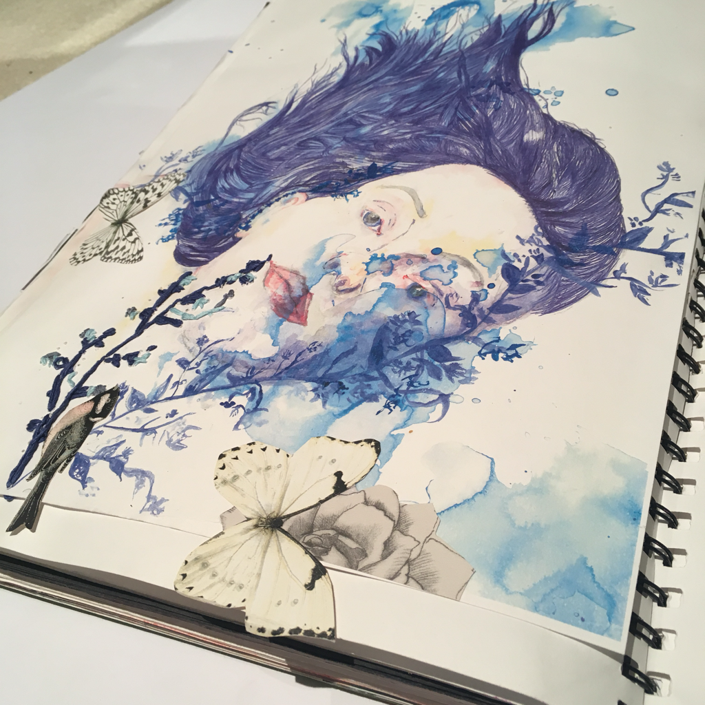 the very first project I undertook was entitled hidden identity. Looking back I feel this was the wrong choice for me as I had not done art (in education) for 5 years so I was felling a little apprehensive! Portraiture, I find is one of the hardest subject matters, so maybe I should have chosen a theme that would have been a little easier to begin with. That being said I think towards the end of the project I managed to get to grips with watercolours, which I combined with biro, collage and stitching in the piece above. I really like the movement created in this piece, via the flowing nature of the hair. I also like the 3D elements which I think add depth ❀ 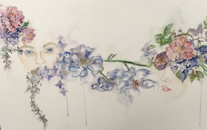 watercolur paint formed the basis of my final piece. I took the theme of hidden identity and looked specifically at how women within society hide their true selves, often focusing on the ideas of perfection. I brought in other techniques into my final piece such as batik (a form of wax resist) and image transfer. Flowers were used to distort & conceal the faces in this piece. To help symbolise the ideal femininity. Although I like the ideas behind this piece I feel I could have executed it much better! theme - structures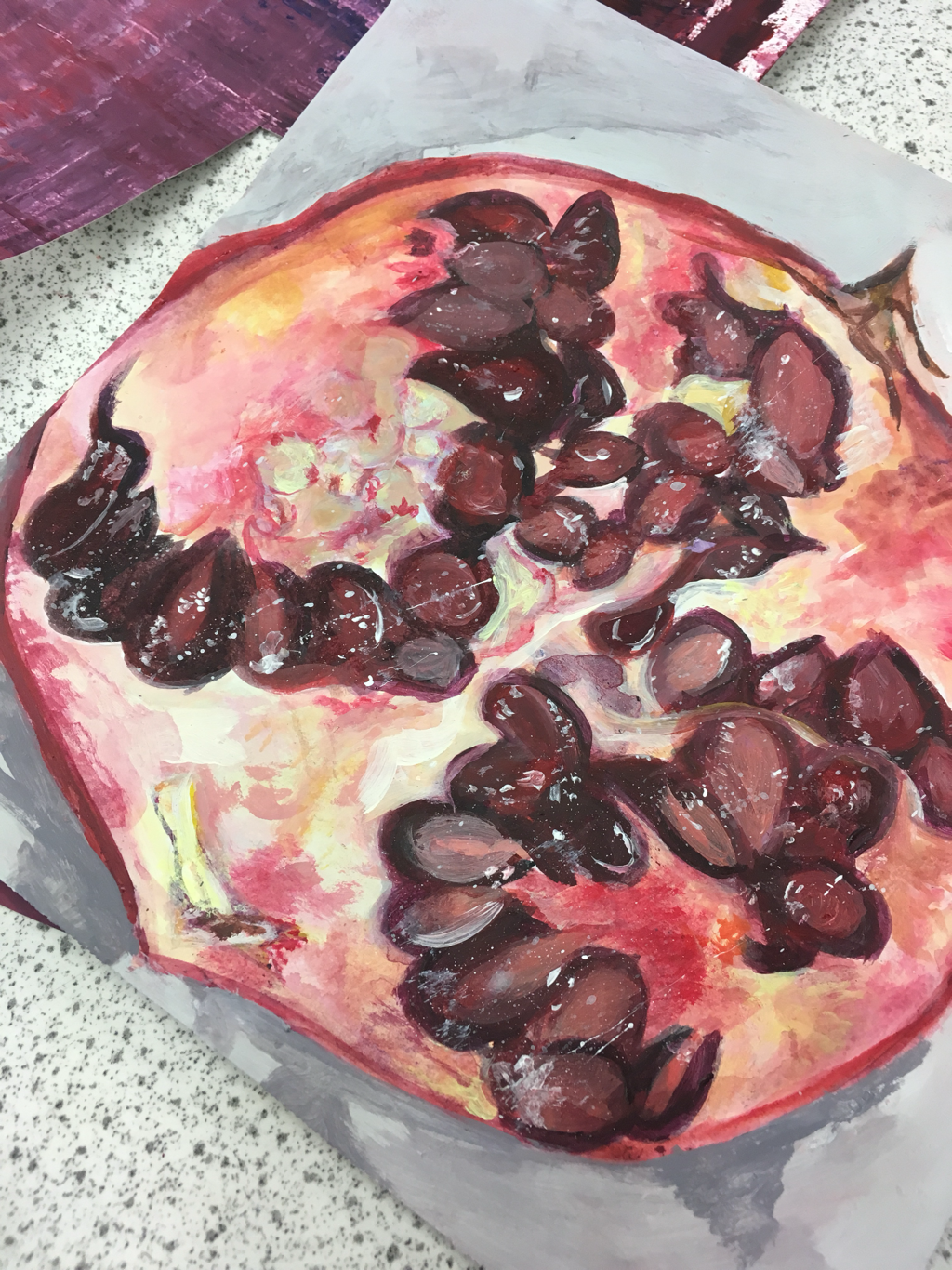 my next theme was structures, and I chose to initially look at organic internal structures. I focused on fruit as I love the natural colours, patterns & forms that occur without any human input. This was my first acrylic still life piece and although I feel some areas could have been improved, I think I captured the texture & tones well overall. 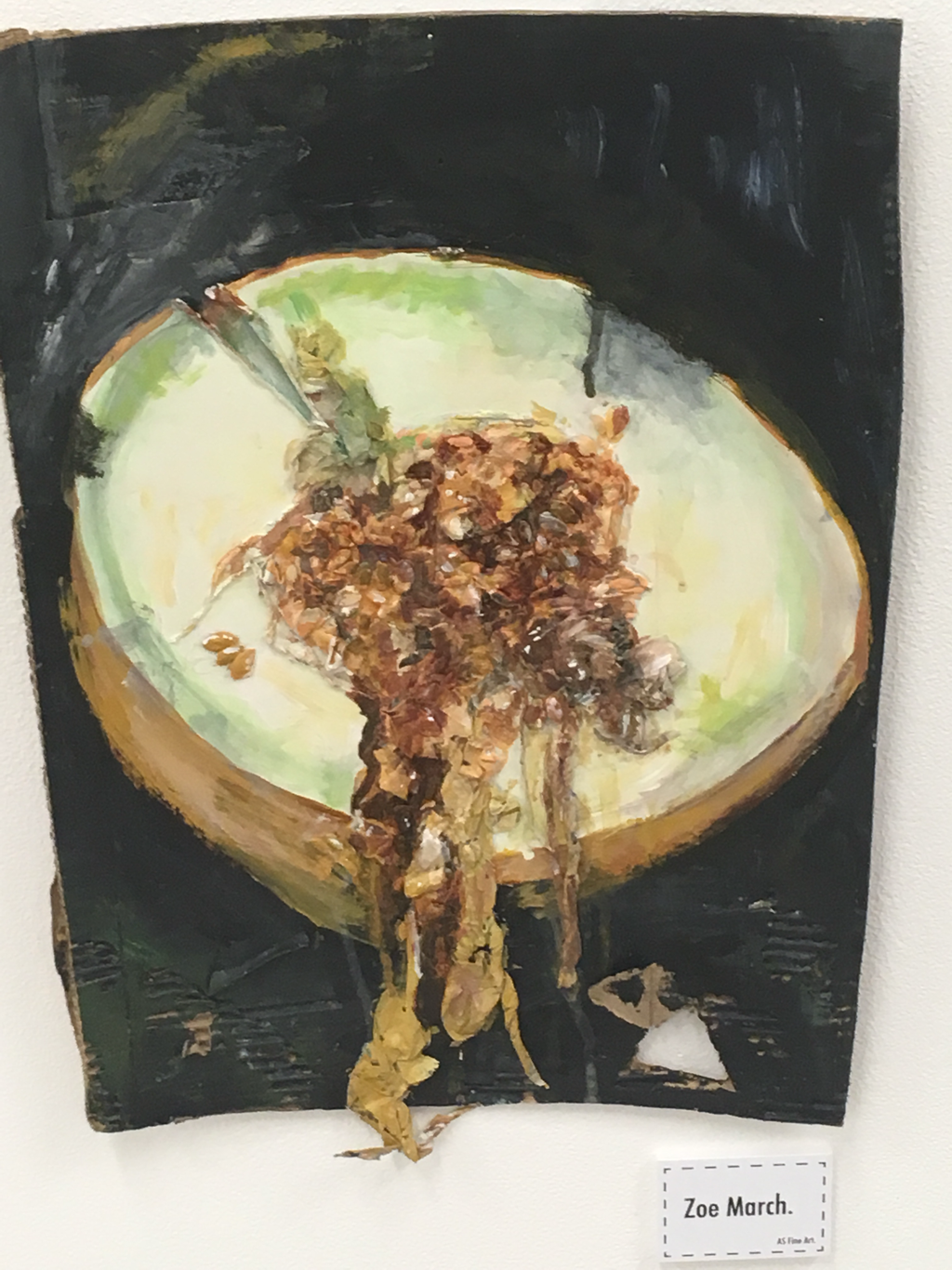 in time I changed my theme to look at human manipulation of natural structures, which lead me to look at the artist Valerie hegarty. I chose to work in a more 3D way, in this piece I enjoyed incorporating in melon seeds & , paper mache to create the appearance of the structure decaying/spilling out of its case. ☆ 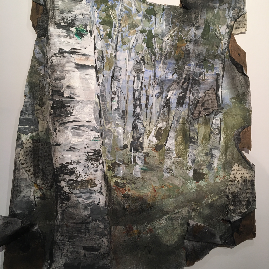 i found myself becoming restless looking at fruit, so moved to another natural structure - trees. I felt I could express my ideas about human manipulation on a much stronger level, researching deforestation, consumerism, forest fires etc. I’m pleased with the outcome of this piece as I was able to incorporate my contextual ideas into my media choices. I did this by using charcoal (a product of trees), burning sections & using newspaper. I also discovered a new process of using a palette knife to apply paint! 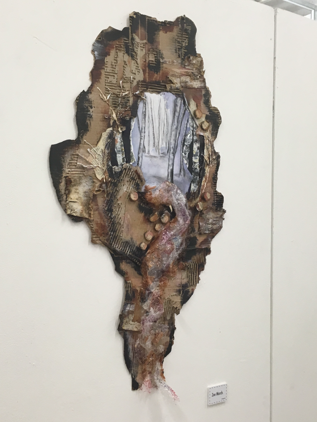 this was my final piece for the theme of structures, and I feel overall it conveyed my idea well! I was focusing on the destruction of trees, and used wood cutting, trees made of receipts (consumerism) bark & newspaper to embellish the cardboard frame of the inner drypoint print. theme- obscure memories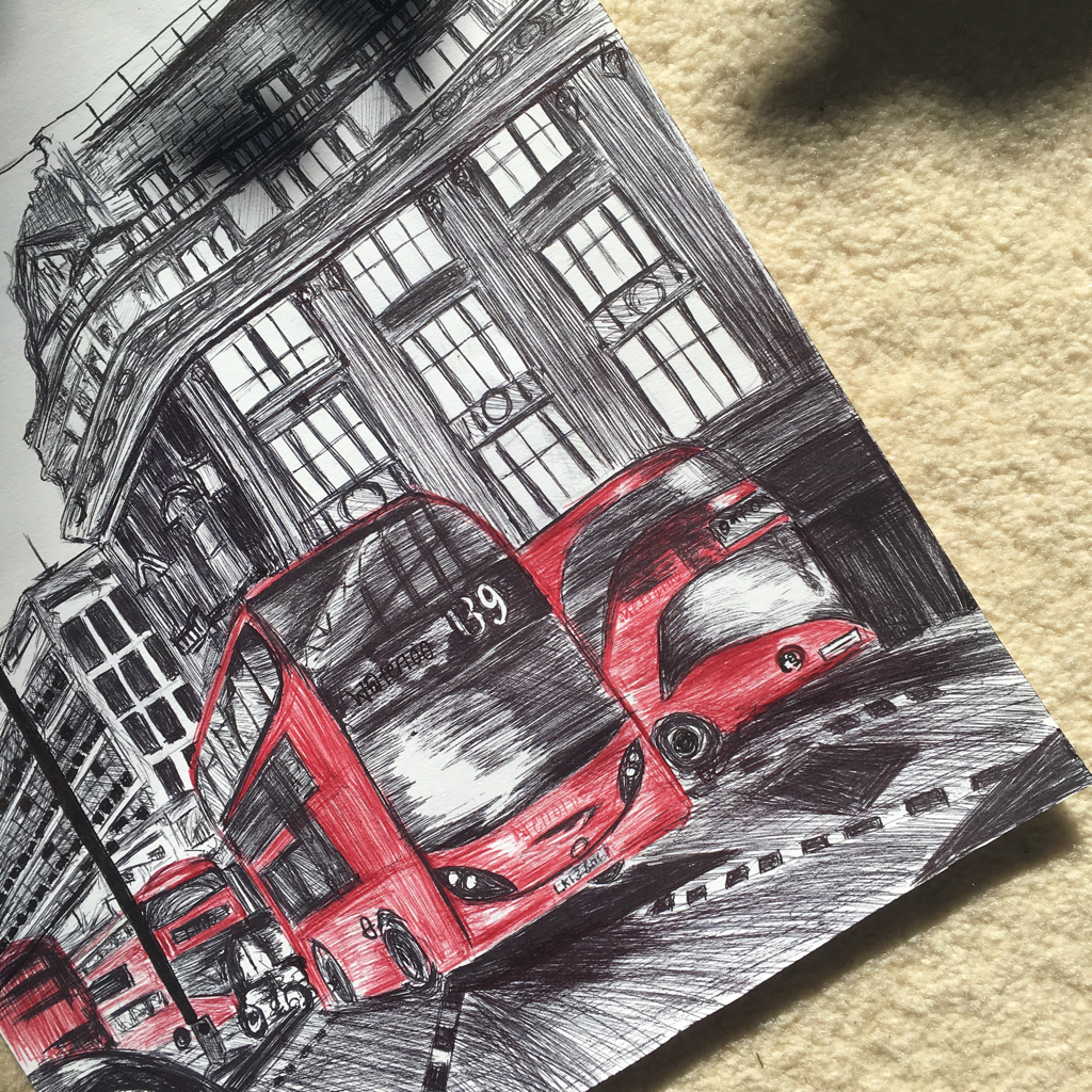 Defiantly my favourite topic & project of the 2 years was “obscure memories.” I chose to combine 2 themes in order to create one that would allow room for more experimentation. Initially I began at just looking at personal memories, using photographs from travels to work from. I really like the illustrative style of this London biro drawing, I think the red of the buses really sets the piece off! 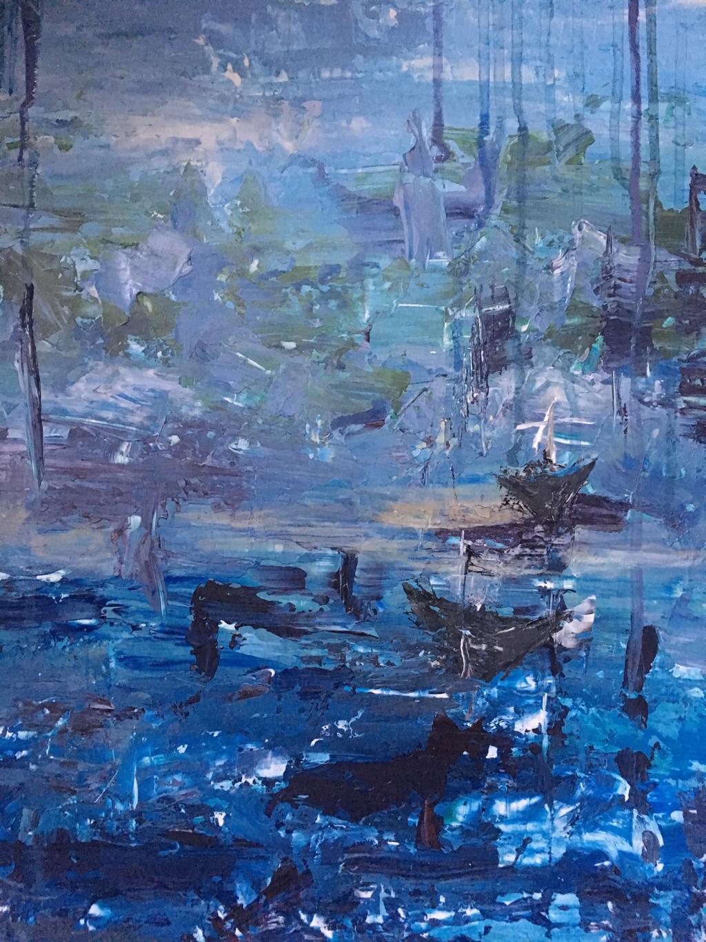 taking inspiration from an artist who’s work I had seen in Corfu (a memory) I decided to create an abstract depiction of a travel photograph. This was created on wooden board, allowing me to layer the paint up thickly creating texture, helping me represent the rocks & water. I felt The abstract nature of this piece linked to the ‘obscure’ part of my theme. 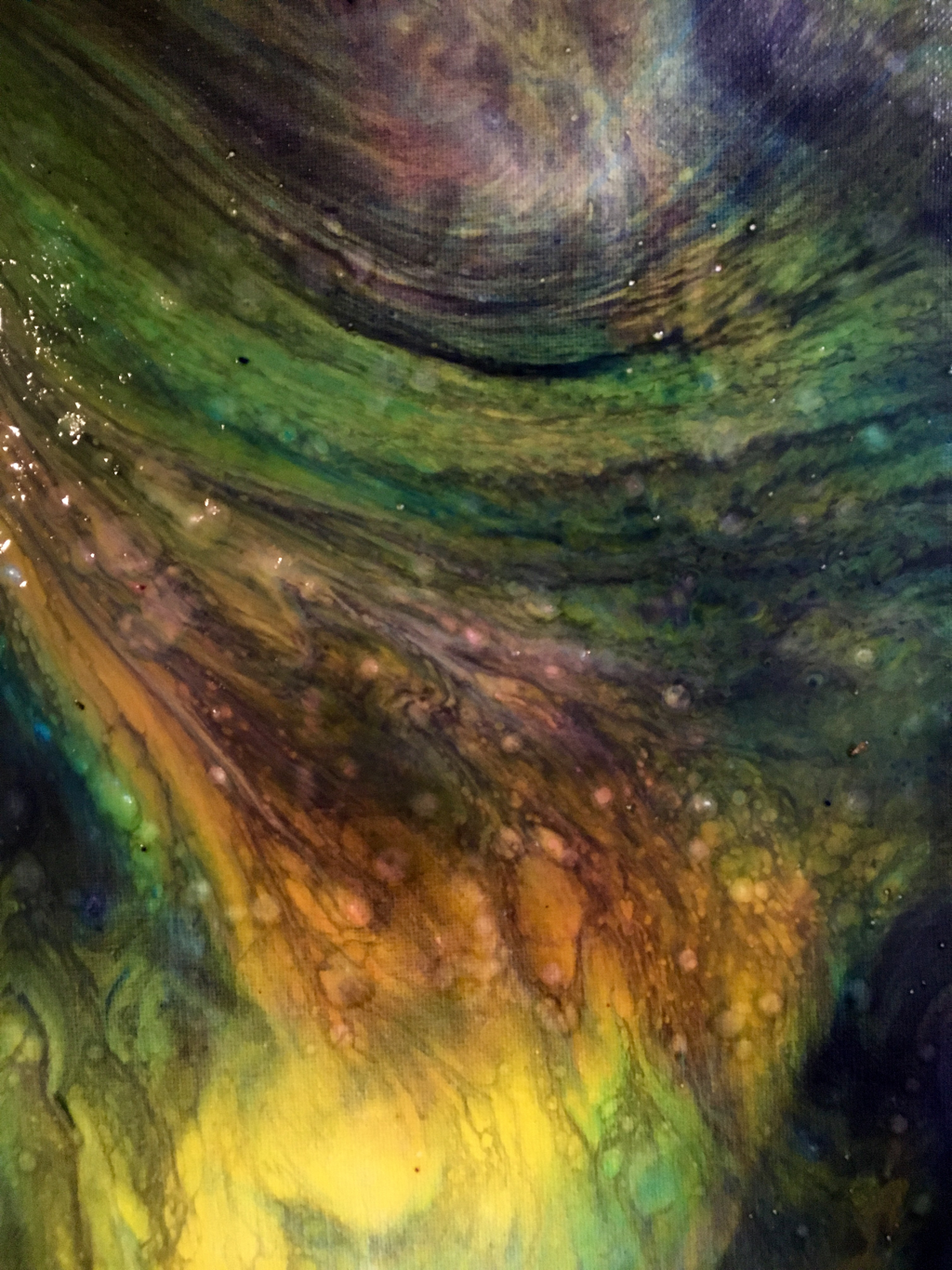 defisntly one of my favourite pieces & techniques I discovered in my time studying art is acrylic/dirty pours. This is defiantly the best one I’ve created! At this point in my project I was looking at subconscious memories & dreams, and how experiences can be distorted via dreaming. I felt the outcome of these acrylic pours showed what I imagined a dream to look like well, and could also be a visual representation of parts & functions of the brain such as Neurons etc ☆ 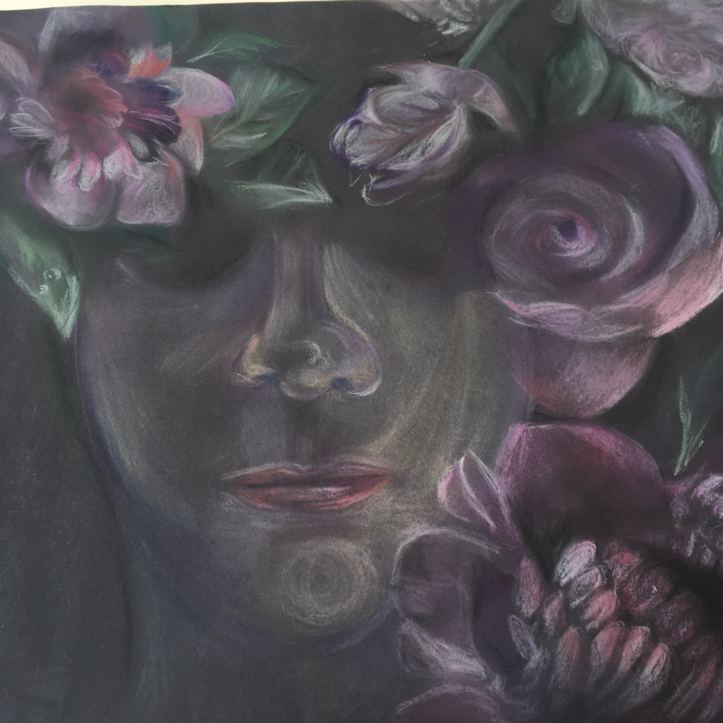 A key point in this project was the discovery of Marco mazzonis work. This lead me to cautiously re-approach portraiture but in a more ethereal way. I wanted to look st how we can cover up certain memories with denial - represented by the flowers that contrast with the dark nature of the piece. I loved working with soft pastel, and found it really easy to blend & build up depth. ♡ 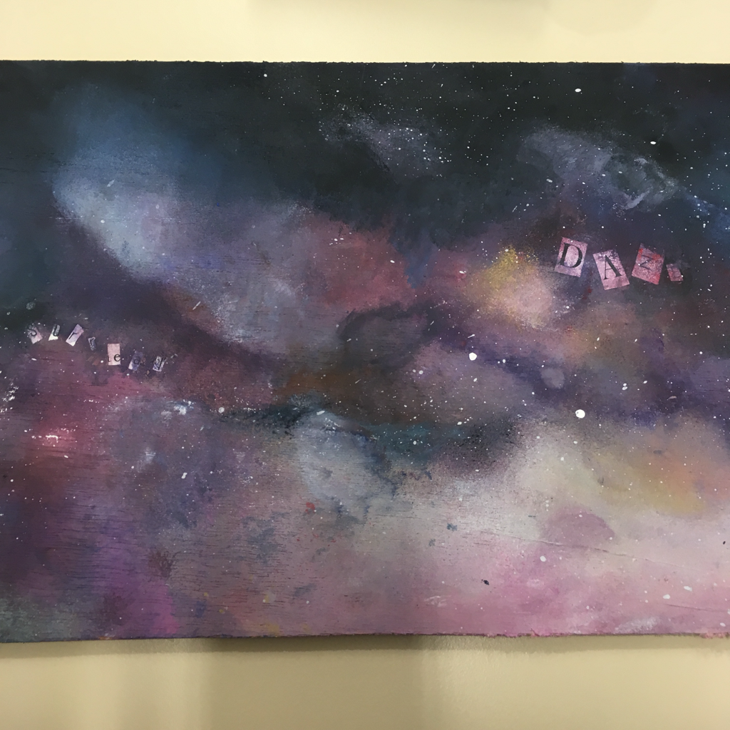 following on from the ethereal dreamy feel of my last piece I decided to try a galaxy style piece rather than an axrylic pour and I felt it suited the pastel drawings better. This piece was created on wood and involved a lot of sponging! To make the piece more interesting I added tiny glitter pieces which I think really added depth ☆ I also began to incorporate collaged text into my work, in order to portray memories & thoughts ☆ 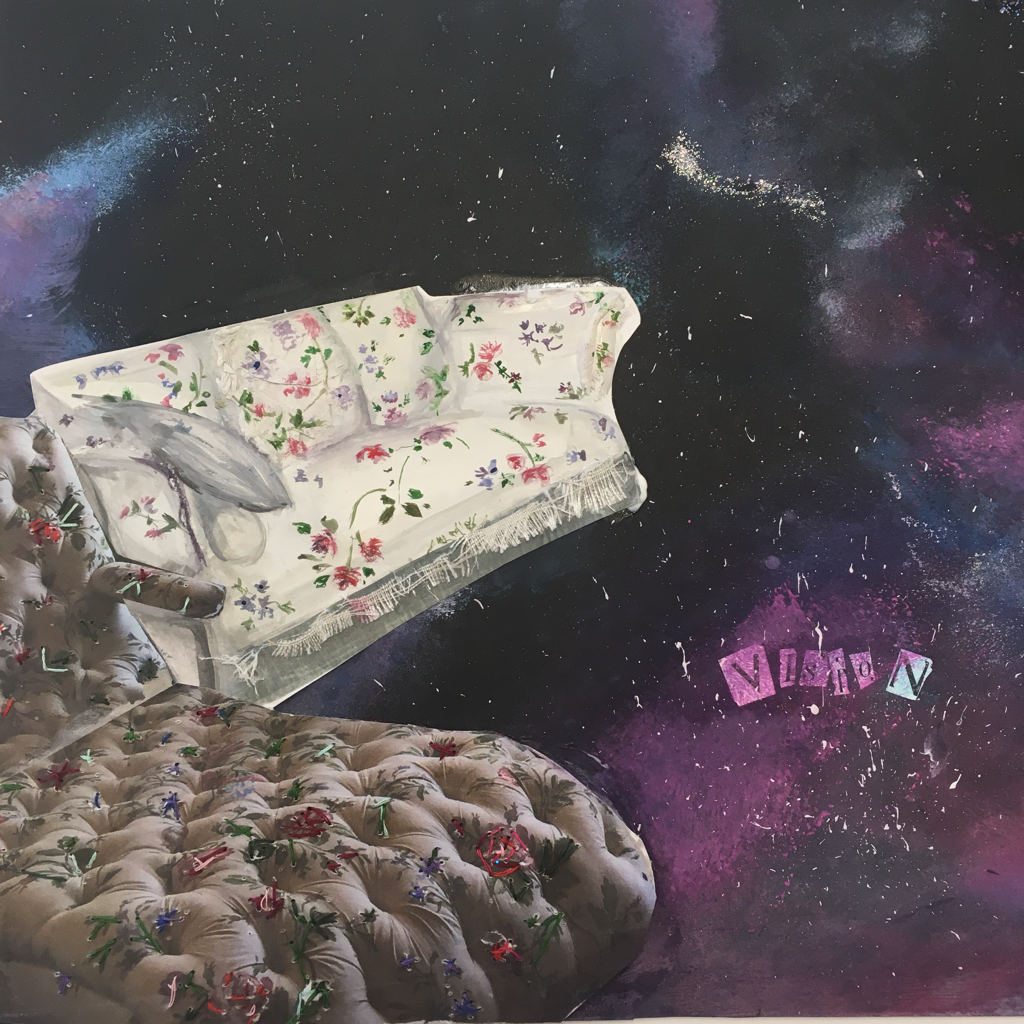 Looking st the obscure side of my theme I decided to add in strange and non conforming objects to the backgrounds I created. This is my favourite one as i took a section of an image taken at Claude monets house, and using acrylic paint & college, superimposed it onto my background. To really allow the viewer to feel as if the objects were real I added 3D elements using Fabric & embroidery.  this is my final piece for this project and it was definitely the most challenging piece I have ever decided to tackle! That being said I am really happy with the outcome and I feel the piece portrays my ideas well. I used picture frames as a universal symbol of memories, in which I framed 2 soft pastel portrait pieces & 1 landscape piece. The galaxy backgrounds with the glitter & college formed the basis of each piece, providing continuity & a common colour scheme. I wanted the faces to imply a level of pain without being too explicit. I fell the soft pastel worked really well to create that dream like effect. I felt that nineties can not be contained to one box, frame etc and they’re so vast & uncontrollable. This lead me to incorporate large lengths of tulle fabric which I sponged with paint and added in 3D flowers to bring the piece together ❀ theme - freedom & limitations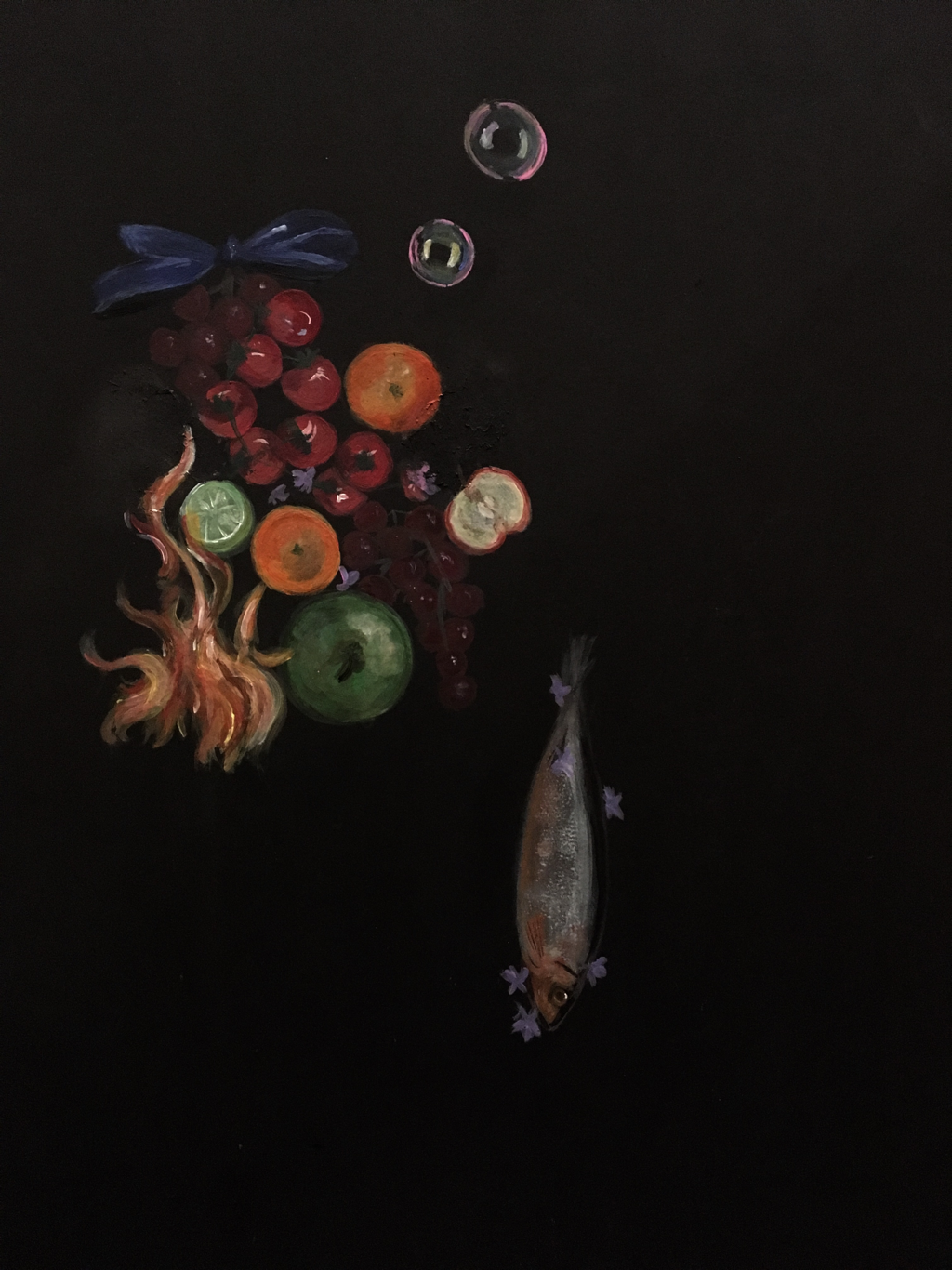 My final theme was freedom & limitations. I took this theme and decided initially to look at life & death / still life. This piece was in response in response to this concept. I really liked the strange sssortment of objects, and the movement created by the bubbles & fish. I did this piece in acrylic paint, which I actually enjoyed, despite talking myself out of ever using it again! 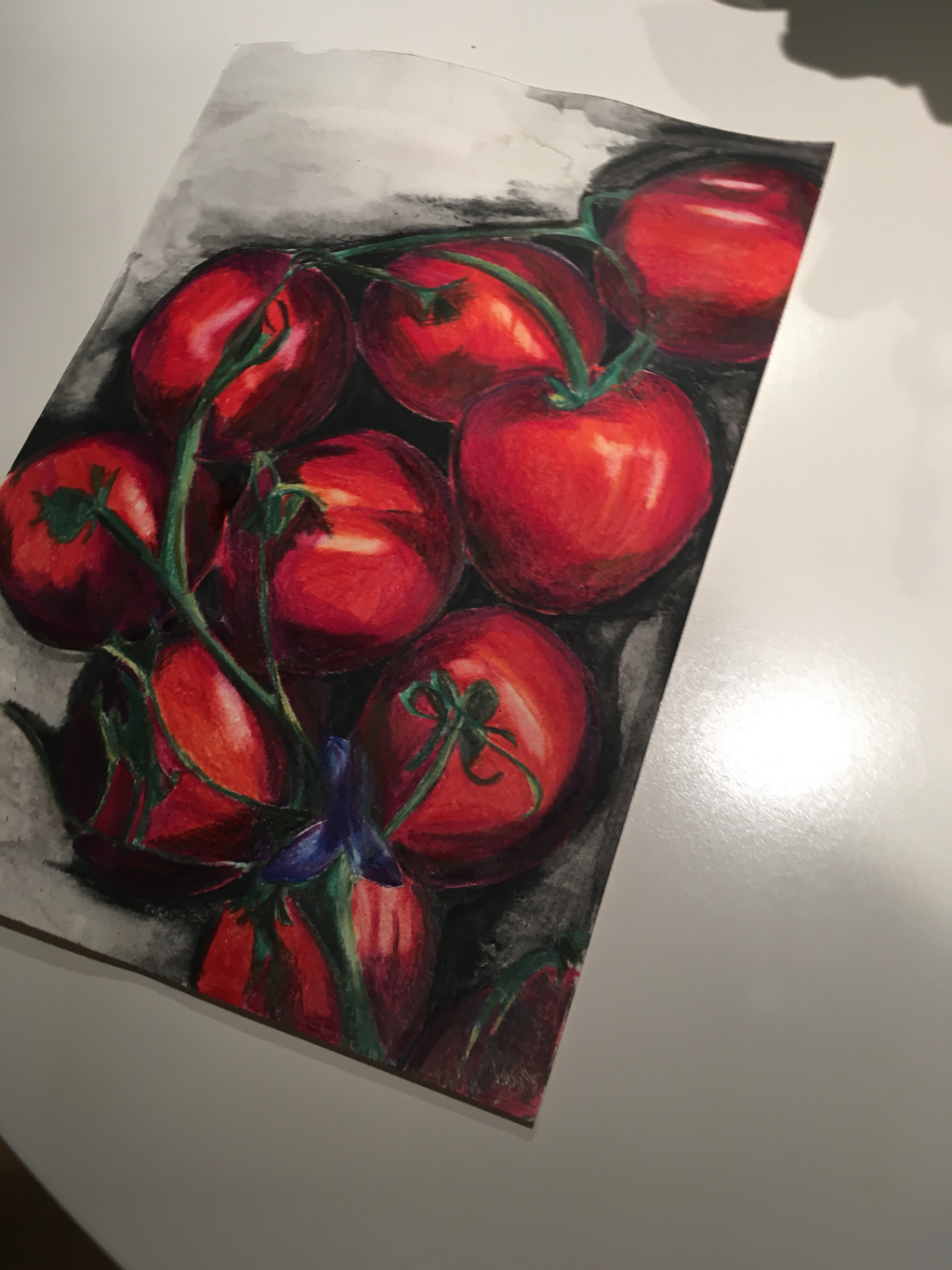 later on I chose to look at freedom & limitations of presentation & media/ in specific colour scheme. This piece I limited myself to 3 colours and only 1 subject matter. I used coloured pencil which I really enjoyed working with as I found I was able to build up great levels of depth whilst maintaining control of the outcome. 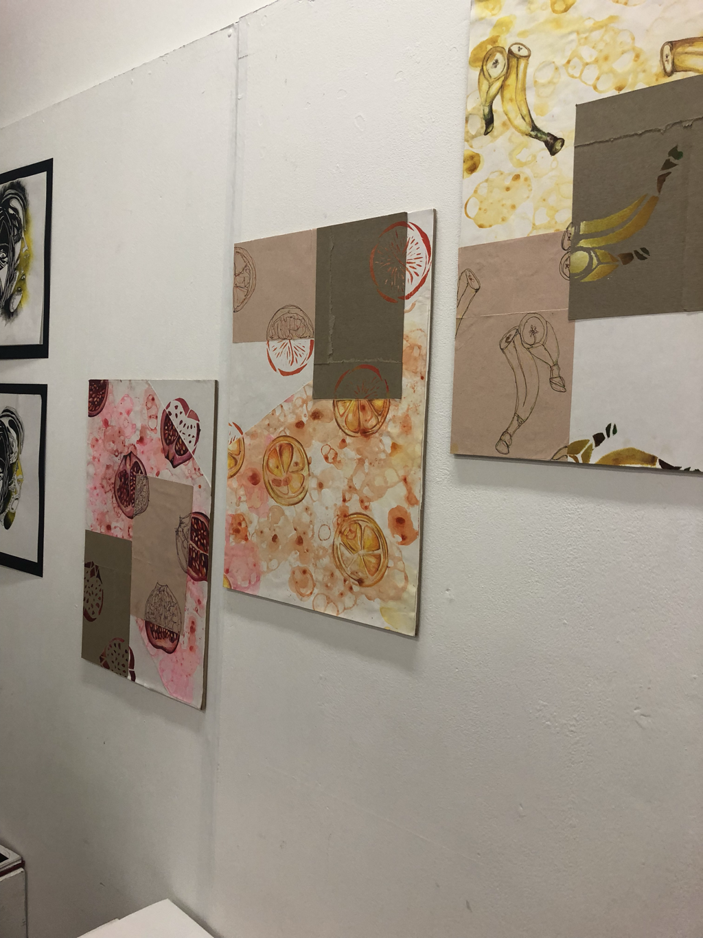 i didn’t feel like I had a lot of time to really develop my idea in this project which could explain why I don’t love my final piece as much as I have in previous projects. I was focusing on rule based art (limitations) where each background type lead to a different media to be used. I also limited the colour palette of each piece to match the fruit. I used coloured pencil, continuous line drawing and stencilling, as well as collage & bubble painting for the background. Although I don’t love it I did enjoy experimenting with new techniques! i really enjoyed writing this post and I hope you enjoyed reading it. I’d love to know which pieces you like & any recommendations for future pieces ☆ you can check out my art Instagram page @lifeinzoeseyes ♡ Zoë x 
2 Comments
Tracey March
17/7/2018 12:12:43 pm
Wow what a truly incredible arrangement of art and pure talent . Your dedication and hard work is obvious and each piece is stunning . Well done you !
Zoe
17/7/2018 02:25:35 pm
Thank you so much! ♥️♥️♥️ Leave a Reply. |
"A girl should be two things, who and what she wants." Welcome to my blog ♡ I hope you enjoy ,
Zoë x Archives
June 2019
CategoriesAll Beauty Christmas DIYs Fashion Fragrance Hair Care Hauls Lifestyle Mental Health Monthly Favourites Nail Art Reviews Skincare Travel |
 RSS Feed
